A 2D digital animation and motion graphics promo that tell the values of the multinational Hitachi Zosen Inova.
Client:
Hitachi Zosen Inova
Executive Creative Director:
Riccardo Galimberti
Executive Producer:
Pietro Polentes
Art Director:
Rachele Santini
Visual Supervisor:
Rachele Santini
Storyboard:
Rachele Santini
Design:
Rachele Santini
Animations:
Chiara Loiacono, Fabrizio Paludetto
Compositing:
Rachele Santini
Hitachi Zosen Inova (now renamed Kanadevia Inova) is a global engineering and cleantech company specialising in waste-to-energy solutions and the production of renewable energy and gases.
The company wanted to tell its story through film, communicating its values while defining and promoting its identity.


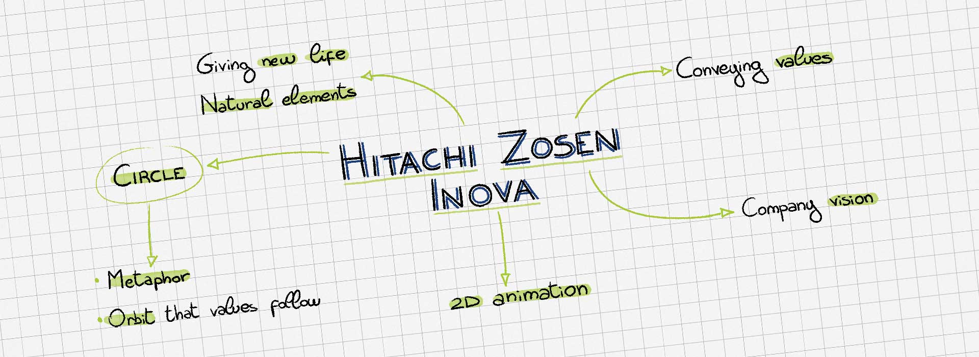
To give the brand the presence it deserved and convey the importance of its values in a more powerful and elevated way, we chose to build the storytelling around associations and visual analogies.
The narrative and visual thread running through the film is the concept of the cycle — the circle. The company operates within a circular economy, just as the cycles of the Earth and nature are inherently circular.
From this idea came the decision to build the entire film around the simple, powerful shape of the circle.
The direction of the film uses the circle as its visual and narrative thread. Many of the scenes grow out of this simple shape, while the opening sequence captures the life of our planet in just a few seconds, moving from the micro to the macro.
Throughout the film, a circular element of the same size is almost always placed at the centre of the composition, symbolising the continuous presence of this endless cycle across every value and aspect of the brand.
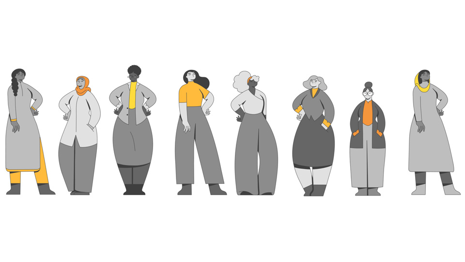
The colour palette was deliberately kept restrained, built around the brand’s core colours and complemented by a few additional tones to create contrast.
The film became a key part of the company’s communication, featuring in numerous conferences and presentations at both internal and external events.
It was also promoted through LinkedIn campaigns and featured prominently on the company’s website homepage.